Contact Us

Use the form on the right to contact us.

You can edit the text in this area, and change where the contact form on the right submits to, by entering edit mode using the modes on the bottom right. 


123 Street Avenue, City Town, 99999

(123) 555-6789

email@address.com


You can set your address, phone number, email and site description in the settings tab.
Link to read me page with more information.

Blog

Filtering by Tag: viz

Valuing The MLS SuperDraft

Ford Bohrmann

The draft can be a valuable tool to build a successful club in MLS. When expansion teams come into the league they are automatically given the top draft picks. The list of players that entered MLS through the draft is telling. Some of the top goal scorers: Clint Dempsey, Taylor Twellman, Edson Buddle, Brian Ching. Some of the players with the most minutes: Nick Rimando, Brad Davis, Nick Garcia, Brian Carroll. The list goes on.


Some of these players I’ve mentioned were top picks. Brian Carroll was selected 2nd overall in 2000. Taylor Twellman was selected 2nd overall in 2000. Some of the top players who were chosen in the draft were selected in the later rounds, but went on to very successful careers. Chris Rolfe was selected 29th overall. Davy Arnaud was selected 57th overall and scored 54 goals in his career.

On the flip side, there are a number of notable draft busts. Nikolas Besagno was selected 1st overall in 2005 and went on to play in only 8 games. Joseph Ngwenya went 3rd overall in 2004 to Salt Lake and scored 18 goals in his career, while Salt Lake passed over Clint Dempsey, Clarence Goodson and Michael Bradley.

This post aims to provide some context around the value of draft positions. This can be helpful for determining a fair trade (“Should I trade up to a higher selection?”) or looking at how clubs have performed in their draft selections (apparently the Rapids have done a pretty crappy job overall).

Read More

World Cup Performance by Continent (Lots of graphs)

Ford Bohrmann

Much has been made of the inter-continental games so far this World Cup, especially considering the presence of 3 of the 4 CONCACAF countries making it past the group stages, including the US getting out of the group of death and Costa Rica going much farther than anyone predicted.

To see how various (FIFA defined) continents have done compared to past World Cup results, I used past World Cup data collected from 11v11.com. I looked at the past World Cup results (here is an example from the United States’ page http://www.11v11.com/teams/usa/tab/stats/comp/978). These results include all World Cup and World Cup qualifying games, which is what I limited my analysis to. World Cup qualifying games are a little different than World Cup games, but considering these are almost always between countries that are in the same continent, I think its OK because I drop intra-continent games anyways. What defines a continent is pretty hazy, so I just stuck with FIFA’s definitions. This means that Australia is actually a part of Asia, and some other anomalies. This division of the world is the best way to stay consistent, though. The continents I ended up using were Africa, Asia, CONCACAF, Europe, Oceania and South America.

If you want to look at the code I wrote to do the analysis (the data scraping, the actual analysis, and the visualization) head over to here https://github.com/fordb/wc-continent-headtohead 

There’s nothing too crazy going on in the analysis, just a lot of graphs to look at.

Read More

Underdogs and Inefficiencies

Ford Bohrmann

Odds makers tend to do a fairly good job in sports-- While they may not be perfect, it tends to be tough to find any consistent exploitable inefficiencies. In other words, it is rare that the odds of "Liverpool winning at home", or some other event like that, are consistently over or underestimated. You may think that the odds in an individual game may be incorrect, but in the long run inefficiencies like that rarely persist. Why? Because bookies would lose money on them. If they realize they are starting to lose money, the odds are going to be adjusted to better reflect the probability of each result occuring.

While I am not really interested in betting on soccer myself, odds do provide an interesting estimate of the probability of an outcome occuring. For example, take Arsenal's home game against Chelsea this past year. Bet365 put the odds of an Arsenal victory at 2.38. These decimal odds imply that they expect the probability of an Arsenal victory to be about 42%. Taking in to account that the odds makers usually lower the payouts so that they make money, the adjusted probability of an Arsenal victory is just over 41.1%.

This is all pretty standard stuff. The odds for relatively evenly matched games like the one above are probably pretty accurate, or at least more accurate than your average person. But what about significant underdogs? What about City against Cardiff? These are a little more difficult to assess. It's clear that Cardiff is an underdog in this game, but how much of an underdog? And do odds makers do a good job of assigning implied probabilities to these lopsided games?

Read More

Goal Time Analysis

Ford Bohrmann

If you had to place a bet, at what minutes do you think the most goals are scored during the course of a soccer game? I was asking myself this exact question, so I decided to try to figure out what the answer was. If scoring is completely random we would expect the distribution of the count of goals scored to be roughly even across every minute of the game. Of course, it is not going to be perfectly distributed because of random errors, but every minute should have roughly the same number of goals, assuming the sample is large enough. I had a hunch that this would not be the case. Specifically, my guess was that there would be more goals scored between the 85th and 90th minutes, whereas there would be fewer in the first 5 minutes of the game. To test this hypothesis, I used data from the Rec.Sport.Soccer Statistics Foundation page from 8 years of the Premiership.
Read More

Visualizing Twitter Data

Ford Bohrmann

twitter-soccer-bird.jpg

Inspired from this post on plotting the frequency of Twitter hashtags over time, I was interested in trying to apply this to soccer some way. While not the most technical analysis, I thought it would be interesting to use this tool to analyze transfer rumors.

To summarize the process quickly, there is a package in R (open source statistical software) called TwitteR which allows you to pull Twitter data. It's actually a fairly easy process, especially if you follow the tutorial in the link at the beginning of this post.

As most Twitter users know there is a seemingly unlimited number of transfer rumors circulating Twitter. These range from being fairly plausible to pretty ridiculous ("Ronaldo to the Philadelphia Union???).  As a Manchester City supporter, I was curious at looking at a few popular transfer rumors related to City.

Robin van Persie to Manchester City:

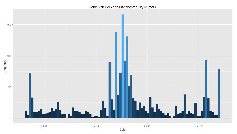
Yes, this is definitely a rumor, and yes, it is probably not going to happen. But I was still curious. Below is a plot of the frequency of the number of tweets that include "Robin van Persie" and "Manchester City". Of course, this is an imperfect method, but it still gives us an idea of what is going on in the Twitter transfer rumor world.

rvp.png

To explain, the graph below measures the number of tweets described above at a 2 hour interval for the past week. This means the height of every line gives us the number of tweets referencing RVP and City in that 2 hour interval.

Carlos Tevez to AC Milan:

After Tevez's past season with the club, there are obviously transfer rumors concerning Tevez all over the place. Because of this, it was hard not to want to look at the data on Tevez. I picked AC Milan because it seemed like the club he had the highest likelihood of going to. Like above, I searched for tweets that included "Carlos Tevez" and "AC Milan". The frequency of these tweets, in 2 hour intervals, is plotted below.

tevez.png

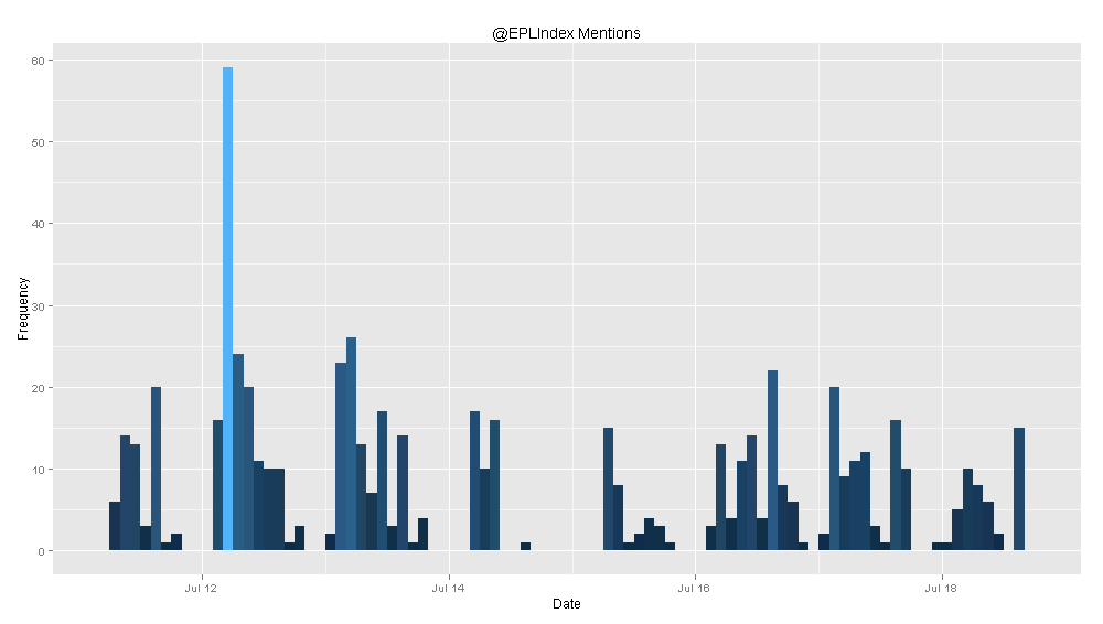
You can try to analyze these graphs to find some meaning, but they are more just a fun exercise than anything else. The TwitteR package lets you do other cool things, like plot the frequency of Twitter mentions for a user. I did this for another site I write for, EPL Index. They tend to get a lot more mentions than @SoccerStatistic does, so I thought it would be more interesting to plot the frequency of @EPLIndex mentions. Again, the intervals are every 2 hours.

eplindex.png

Like I said before, this analysis is not very insightful or ground-breaking, but still pretty cool nonetheless. The possibilities for future analysis like this are almost endless, so if people have good ideas of Twitter data to visualize, I'd love to hear them.

Possession Analysis: A Closer Look

Ford Bohrmann

There is no shortage of analysis done recently on the fact that possession statistics tend to be misleading. A while ago, I looked at how teams with higher rates of possession in the MLS do not tend to win more games. Similarly, the Climbing the Ladder blog on the MLS website recently did analysis and found very similar results. Devin Pleuler (@devinpleuler) has done even more analysis on why possession stats are misleading for his Central Winger blog on the MLS website. On his personal blog, Devin has also looked at possession efficiency and how it relates to winning. Even more, the 11tegen11 blog (@11tegen11) has written about some interesting points on how to better analyze possession. I'm sure there are even more that I have forgotten to list here, but you get the point.
Read More

EPL Table Visualization: A Different Perspective

Ford Bohrmann

After the positive comments and interest in the scoreline visualization chart I posted last week, I decided it would be interesting to do another type of data visualization. Processing, the software I've been using for these visualizations, lets you do some cool stuff with making the visualization interactive. This week, I decided to make a more complete and informative visualization of the English Premier League table. 

I tried to make it as stand-alone as possible. In other words, I wanted people to understand it just by looking at it without other information. One point: its interactive in that you can scroll your mouse over a club's circle and it will give you information on them. If you are interested in more analysis and how I created it, read below.

Read More

Scoreline Visualization

Ford Bohrmann

The idea for a scoreline visualization originally came from Devin Pleuler (@devinpleuler on Twitter). He had the idea to create a graph that represents how soccer scorelines tend to progress, representing both how often scorelines end a certain way, and how often games flow through a certain scoreline.
Using data from 1000 EPL games from the RSSSF, I've created this chart using Processing, which you can find below.
Read More

Refining The Win Probability Statistic

Ford Bohrmann

Last year I was planning on going to go to the Sloan Sports Conference but ended up not being able to make it. I was thinking about it again this year, and I decided it wouldn't be a bad idea to submit something for this year’s conference. At first I wasn’t going to, but why the hell not? Might as well go for it, I guess.

My win probability added statistic has generated some interest for people, and I think it gives some pretty interesting insight, so I’ve been working on expanding it. If you have no idea what win probability added is, check out my first post on win probability and another on win probability added. Anyways, thus begins my quest to refine and expand the win probability added statistic for submission to the sports conference. To make it a lot better, comments, criticisms, and suggestions are very much appreciated and would help a lot.

The first fix I made was change the name based on a simple fix. The problem with “win probability added” is that it doesn’t necessarily calculate the win probability added. That’s a little bit problematic. For example, if two teams are tied in the 90th minute, the win probability under my old calculations was .333 for both teams. This doesn’t really make sense, because each team has close to a 0% chance of winning the game, not 1/3. This comes from modeling the statistic after the similar calculation in professional baseball. My fix for the problem is extremely simple: multiply all the values by 3. This changes the statistic from win probability added, to the expected points added. It basically makes much more sense now. If a player scores a go ahead goal in the 90th minute, the Expected Points Added (easier to write EPA from now on) is going to be almost 2. If a player scores a tying goal in the 90th minute the EPA would be almost 1. Much simpler and easier this way (originally got the idea from @11tegen11’s similar analysis).

After this, I noticed the graphs were not nice easy curves. Even though I took a big sample size of games (about 10 years worth) there isn’t enough data to give a nice curve. To fix this, I just created lines of best fit for each game situation. The home and away graphs for each minute and goal differential are below. Before there were a few situations that didn’t give a realistic expected point total because there were so few game situations (like a 2 goal lead in the 5th minute). Making the nice smooth curves fixes this problem. It also allows me to use equations to calculate EPA instead of the annoying process of referencing a massive excel chart.

I think there’s a lot of possible paths to take from here. I’m going to recalculate the top goal scorer’s EPA using the equations. It won’t change much, but it’ll be nice to have some continuity because I’ll be calculating EPA week by week for every goal next EPL season.

I’m also working on creating a database of the top goal scorers in the last 10 years in the EPL with their goal totals and their EPA over the years. Looking at goals and EPA over time will hopefully give some insights in to clutch (or lack thereof) goal scoring. If some players consistently have very high EPA’s and some players consistently have low EPA’s, it could be an indicator of clutch goal scoring in football.

Like I said before, I’d love comments and suggestions on ideas for where to go next on the blog, via Twitter, or even email. 

Does More Possession=More Wins in the MLS?

Ford Bohrmann

In the past couple of blog posts I've looked at two common statistics and shown that they are not as meaningful as most people believe. shots on goal do not predict success very well, and assists favor players on better clubs. In keeping with this theme of misleading statistics in football, I decided to look at possession data. The commonly held notion is that the team that has the ball more (has a possession percent over 50) is more likely to win. This makes sense. A team with the ball more is more likely to score and less likely to concede. But does the data back it up? Does having more possession than your opponent mean you are more likely to win the game? I looked at the possession data from the MLS season so far. What I found goes completely against what most people would think. So far this season in the MLS, the average possession percentage for teams that have won the game is 48.5%. Teams that win actually posses the ball less. This means the average possession percentage for losing teams is 51.5%.

To get even more specific, I broke down the possession data further. Winning home teams average 50.9% possession, and winning away teams average 43.4% possession. On the other side, losing home teams average 56.6% possession and losing away teams average 49.1% possession. The histograms below illustrate these facts. I found that away teams, on average, have a possession percentage of 47.3%, and home teams have a possession percentage of 52.7%.

So what does all this mean? It seems possession percentage in the MLS does not predict success. Teams that possess the ball more don't win more; they actually lose more. Home teams also have a slight advantage in possession percentage compared with away teams.

What about teams that completely dominate possession? You might think that a team that had the ball much more often than their opponent would be much more likely to win. I defined "dominating possession" as having the ball more than 60% of the time. So far this season, teams that have dominated possession have a record of 10 wins, 19 losses, and 18 ties. Domination in possession? Yes. Domination in wins? No.

This analysis calls in to question statements like "the Union had the run of play, they possessed the ball more and deserved the win." It's apparent that in the MLS, possession is not all that important when it comes to winning games. So what's the problem with possession? One reason could be that the best teams do not play possession football. The teams with the most success may play kick and run. Another possibility is that possessing the ball simply doesn't lead to wins. Either way, having the ball more than your opponent does not mean much in the MLS.

An Analysis of City Pre/Post Abu Dhabi Using the Transfer Price Index

Ford Bohrmann

Pretty soon I'm going to start writing the Manchester City statistical blog over at http://www.eplindex.com/ (@EPLIndex). I also just read Pay As You Play by Paul Tomkins. If you haven't read it and you're interested in statistics and football, you should really give it a read. The book basically outlines the trend in the EPL that money buys points using what Tomkins calls the Transfer Price Index. More specifically, the higher the cost of the XI (Tomkins refers to this as £XI) the more a team tends to win. Of course, there are exceptions to this, but in general it seems to hold true. Anyways, when I was reading the book I thought it would be a good idea to analyze City using Tomkin's data, especially when I saw that my future fellow City blogger at EPL Index Danny Pugsley (@danny_pugsley) wrote the "Expert View" for the City section. I'm no expert on the analysis that Tomkins does, but I understand a good amount from reading the book. The subject of the book rings especially true for City considering the recent Abu Dhabi takeover and sudden influx of large amounts of cash for the club.

Some notes before the analysis: One, the data I am using is all from the book Pay As You Play, as I mentioned above. Two, make sure to notice some data is missing for years when City was not in the top flight. Three, the data in the book only goes to the 2009/2010 season, so the 2010/2011 season is missing.

Basically, I looked at 3 questions: 1.) Does City really spend more money since the Abu Dhabi take over? 2.) Does a higher £XI cost equate to success for City in the EPL? 3.) Screw 1 and 2. What if City keeps buying Robinho's?

Does City really spend more money since the Abu Dhabi take over?

Yeah, really dumb question. Pretty obvious the answer is yes. Below is the graph comparing the league average starting eleven cost and the City starting eleven cost since 1992. In the 2008/2009 City's £XI is higher than the league average for the first time since the 1994/1995 season. Remember, Abu Dhabi took over at the start of the 2008/2009 season. For the 2009/2010 season it skyrockets to over £120,000,000. City now has money to spend.

Does a higher £XI equate to success for City in the EPL?

The answer Tomkins gives for EPL clubs in his book is yes. Again, this makes sense. Clubs that are able to spend more on players should be able to produce higher quality sides and win more. I wanted to analyze specifically City's success, so I looked at the data to see if their £XI rank in the EPL follows their league position. In other words, does City succeed more when they spend more? Looking at the graph below, the answer seems to be yes. The league postion (green line) generally follows the club's £XI rank (orange line).

Screw 1 and 2. What if City keeps buying Robinho's?

The first two graphs seem to point to inevitable success for City. They have a lot of money and money can buy success, so they'll succeed, right? People will obviously point to some recent not-so-successful expensive purchases. Robinho, Jo, and Santa Cruz are the 3 big ones. Each has had start percentages of 47, 16, and 16 respectively, despite a massive total cost of £69,000,000. A good graphic to show the efficiency of purchases is the cost per point used in

Pay As You Play

. Clubs that are efficient in this regard will have spent less money per point earned, while clubs that are inefficient will do the opposite. The graph shows how much City spent in each year for each point they earned. Not surprisingly, the cost per point has spiked since 2008. This may seem like money is being wasted. While City may not be getting as much bang for their buck, it likely won't matter in terms of success. According to Tomkins, the highest cost per point goes to Chelsea in 2006/2007. They finished in 2nd that year. It seems that simply having a lot of money can trump inefficiencies displayed from the cost per point value. Tomkins even refers to City's high cost per point on page 18: "Manchester City will certainly close the gap for this unwanted honour (although if they win the league, they won't care what people think; they could probably afford to pay £4m or £5m per point if it would guarantee them success)." So yes, City may make some poor purchases like Robinho, Jo, and Santa Cruz in the future. All in all, it doesn't matter that much though. City has so much money that they'll win anyways.

Fun With Graphs

Ford Bohrmann

Often graphs can tell us a lot more about certain data then just the numbers itself. At least they are usually easier to understand. I just downloaded Aaron Nielsen's (@ENBSports) amazing database from the 2010 MLS season and started playing around with it. Here are some interesting graphs I came up with:

This is probably a graph that already exists somewhere, but I made it anyways. It really highlights how much Seattle dominates attendance in the MLS. Also added in a bar for average attendance (between Chicago and Salt Lake) for comparison.

Another graph that highlights domination (in this case probably in a negative sense) of one team over all the others. All teams fall in the range of 1.4 to 1.8 cards per game. However, its clear that Toronto is an outlier with 2.17 cards per game.

This graph once again shows domination by one team in a certain statistic. Dallas scored almost 20% of their goals from PK's.

That's 1 out of every 5 goals

. This almost doubled every other team in the MLS last season, and was 10 times the percentage of Seattle. Hmm. Not exactly sure what the explanation here is. Is Dallas really good at diving? Are they being favored by refs? Are they just getting a lot of chances in the box? Something to look at in the future.

For the percentage of goals scored outside the 18, I took the 2 lowest, 2 highest, and the average. Dallas (likely from their massive share of goals from PK's) and Columbus have the lowest percentage of goals scored from outside the 18. New England and Chivas USA have the two highest percentage of goals scored from outside the 18. This shows not every team is scoring goals the same way in the MLS. Having a high percentage of goals from outside the 18 doesn't exactly mean the team is being creative or is better at long distance shooting. Instead, it more likely tells us that the team struggled in scoring goals within the 18, where the bulk of goals are scored. Dallas and Columbus were 4th and 5th last year, respectively, while New England and Chivas USA were 13th and 15th, respectively.